

Creating a cozy spot to curl up with a good book is honestly one of my favorite things to do in a home. There is something deeply satisfying about taking an empty, overlooked corner and turning it into your own quiet little world.
And here is the thing. You do not need a massive house or a dedicated library room to make it happen. Even the tiniest bedroom corner can become a beautiful, restful sanctuary with the right touches.
Reading nooks are having a serious moment in 2026 home design. People are craving that escape. A little pocket of calm away from screens, notifications, and the general noise of daily life.
In this guide, I am sharing 20 of my favorite reading nook ideas, covering everything from furniture layouts to lighting choices to color palettes. Whether your style is cozy farmhouse, sleek minimalist, or full-on maximalist chaos, there is something here for you.
Grab your favorite mug of tea. Let us get into it.
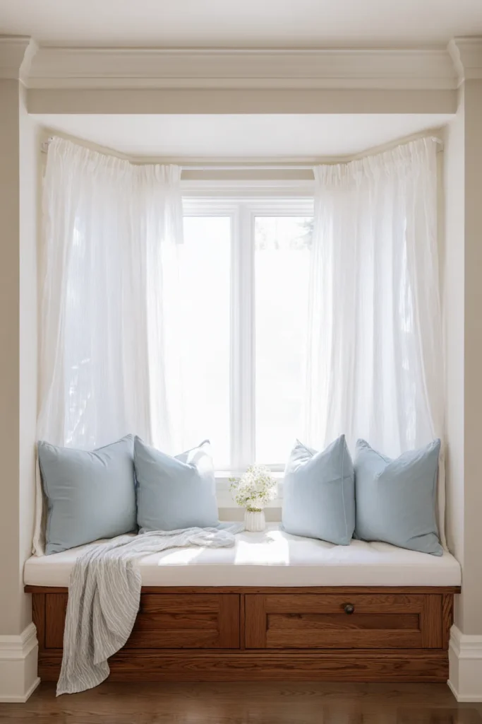
1. The Classic Window Seat Oasis
There is a reason window seats have been a beloved home feature for centuries.
Sitting beside a bright window just feels right. Natural daylight is the best reading light there is, and it significantly reduces eye strain compared to artificial bulbs. The moment you sink into a cushioned window bench with sunlight streaming in, your whole body relaxes.
The key design elements here are a sturdy built-in bench and a thick, generously padded cushion. Soft linen curtains frame the space beautifully while gently filtering that harsh afternoon sun. Woven wood shades add a layer of natural texture without making the space feel heavy.
For colors, I always come back to soft whites paired with gentle sky blues. It is clean, calming, and timeless.
A few things that make this style work:
- Hidden storage compartments built beneath the seat (perfect for extra blankets)
- Layered window treatments so you can control light at any time of day
- Throw pillows in varying textures to add depth without visual clutter
Designer tip: Always layer your window treatments. Sheer panels plus a Roman shade gives you full control over brightness throughout the day.
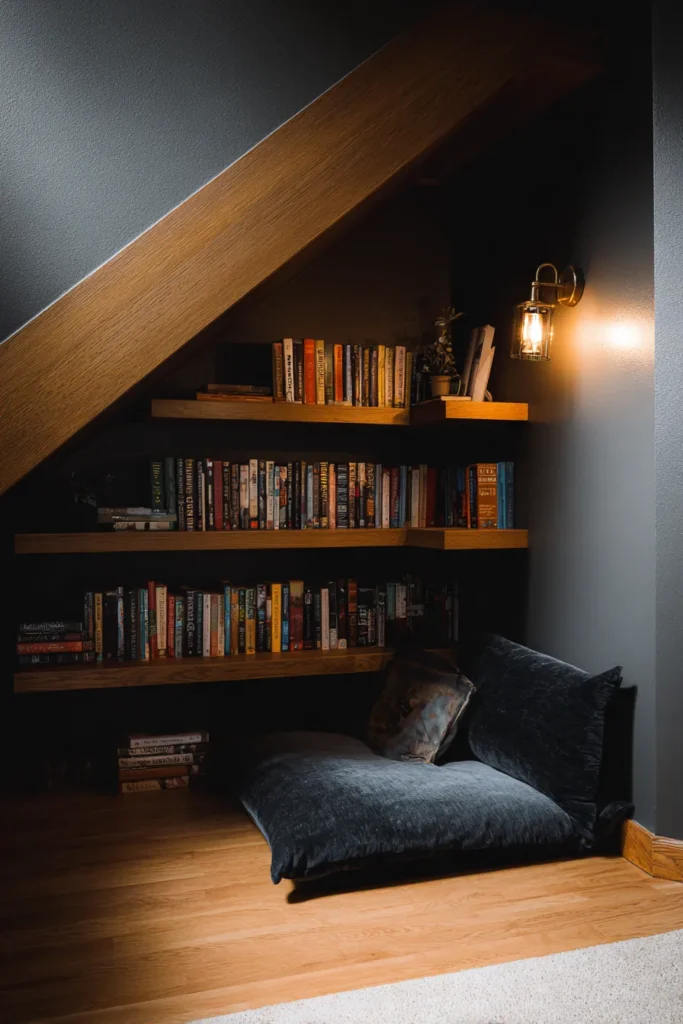
2. The Charming Under-Stairs Sanctuary
Most people look at the space under their staircase and see wasted square footage. I look at it and see the coziest reading nook in the house.
That tucked-away, slightly cave-like quality is actually a feature. It creates a sense of enclosure that feels naturally sheltered and private. Like your own little burrow inside the house.
The key design elements here involve custom floating shelves for your books and a deep, floor-level cushion that you practically sink into. Since natural light is limited under stairs, built-in wall sconces are essential. They replace what the window cannot provide and add a warm, amber glow to the space.
I love a palette of charcoal gray walls paired with natural oak wood for this one. The contrast is rich and grounded without feeling cold.
Materials to reach for:
- Soft velvet fabrics (they make an enclosed space feel luxurious rather than cramped)
- A small woven basket nearby for your current reads and bookmarks
- Warm-toned lightbulbs to enhance that cozy, tucked-in feeling
Designer tip: Paint the interior of the nook a slightly darker shade than the surrounding room. It sounds counterintuitive, but it actually deepens the coziness and makes the space feel purposefully designed.
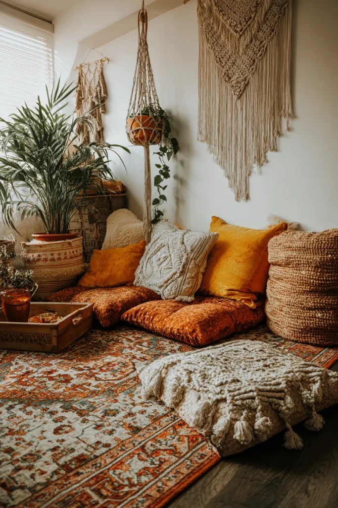
3. The Bohemian Floor Cushion Corner
Not every reading nook needs a chair.
Sometimes the floor is exactly where you want to be. A low, relaxed floor setup brings a casual, carefree energy to a room that upright furniture simply cannot replicate. It is especially perfect for small apartments or tight bedroom corners where a bulky armchair just does not fit.
The star of this setup is a collection of oversized floor pillows layered over a vintage rug. Stack three different cushions together. That gives you the back support you need without sacrificing the low-to-the-ground look. Add a hanging macrame plant holder above for vertical interest without losing any precious floor space.
The color palette here leans warm and earthy. Terracotta, mustard yellow, warm cream. Think of the colors of a sunset on a dusty afternoon. That is the vibe.
Texture is everything in this style:
- Chunky knits for warmth and visual depth
- Smooth leather accents for contrast
- Tufted cotton cushions for that layered, collected look
Keep a low wooden tray nearby for your tea or coffee. It grounds the setup and stops beverages from ending up on your beautiful rug.
Designer tip: Mix at least three different textile textures to get that effortlessly layered bohemian look. Matching everything too closely makes it feel less relaxed and more staged.
4. The Dark Academia Library Retreat
If your ideal reading atmosphere involves moody lighting, leather chairs, and the faint smell of old books…
This is your nook.
Dark academia is all about creating a deeply intellectual, focused environment. The kind of space where you feel like you could solve a mystery or write a novel. Dark colors work here because they naturally absorb light, pulling the room inward and creating a sense of intimacy that brighter spaces simply cannot match.
The essential pieces are a classic leather wingback chair and floor-to-ceiling bookshelves in dark walnut. A brass floor lamp positioned just over your shoulder provides the perfect directional reading light without breaking the moody atmosphere.
The color palette:
| Element | Color |
|---|---|
| Walls | Emerald green |
| Shelving | Dark walnut |
| Chair | Vintage brown leather |
| Lighting | Warm amber bulbs |
| Accents | Deep burgundy and brass |
Organize your books by vintage spine colors if you can manage it. It sounds fussy, but it creates an incredibly cohesive visual effect that pulls the whole space together.
Designer tip: Swap standard bulbs for warm amber ones. They deepen the old-world atmosphere dramatically and make the whole room feel like it belongs in a 19th century study.

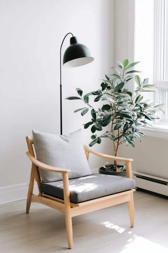
5. The Minimalist Scandinavian Corner
Sometimes the most powerful design move is simply removing things.
The Scandinavian approach to a reading nook is built on one core idea: a clear space creates a clear mind. No visual clutter. No unnecessary objects competing for your attention. Just you, your book, and a beautifully simple corner that lets you breathe.
The key pieces here are a sleek, light-wood lounge chair and a simple side table. A slender matte-black floor lamp provides clean, modern task lighting without overwhelming the space. One structural green plant in the corner. That is it. That is all you need.
The palette stays strict: pure white, soft ash gray, and birch wood tones. Nothing warmer, nothing bolder.
Materials to focus on:
- Smooth, unpolished cotton for cushions and throws
- Light timber that shows its natural grain
- Closed storage cabinets to keep excess books out of sight
That last point is important. Visible book piles, however charming, break the clean visual line this style depends on.
Designer tip: Introduce just one structural green plant. A single well-chosen plant adds life and warmth without creating the visual noise that a collection of objects would.
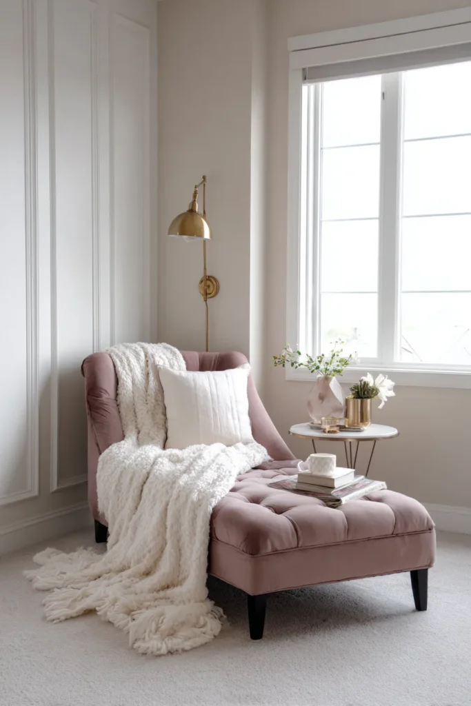
6. The Bedroom Corner Chaise Lounge
A reading nook in your bedroom does something special. It creates a bridge between being fully awake and winding down for sleep.
Instead of going straight from your phone to your pillow, you have a stopping point. A place to decompress, read a few chapters, and genuinely transition into rest mode. The chaise lounge is perfect for this because it is long enough to stretch out on but upright enough to keep you from immediately dozing off.
Choose a luxurious upholstered chaise in calming colors. Lavender, dusty rose, muted warm taupe. Colors that tell your nervous system it is time to slow down.
A plug-in wall sconce mounted above the chair is a smart move here. It saves floor space and keeps the lighting at exactly the right height for reading without disturbing a sleeping partner across the room.
Styling essentials:
- Brushed cotton or faux fur throw for tactile comfort
- A small, round nesting table for your glasses and current novel
- Matching the chaise fabric to your bed linen for a cohesive, intentional look
Designer tip: Coordinate your chaise fabric with your existing bedding. It makes the reading nook feel like it was always part of the room’s design rather than an afterthought.
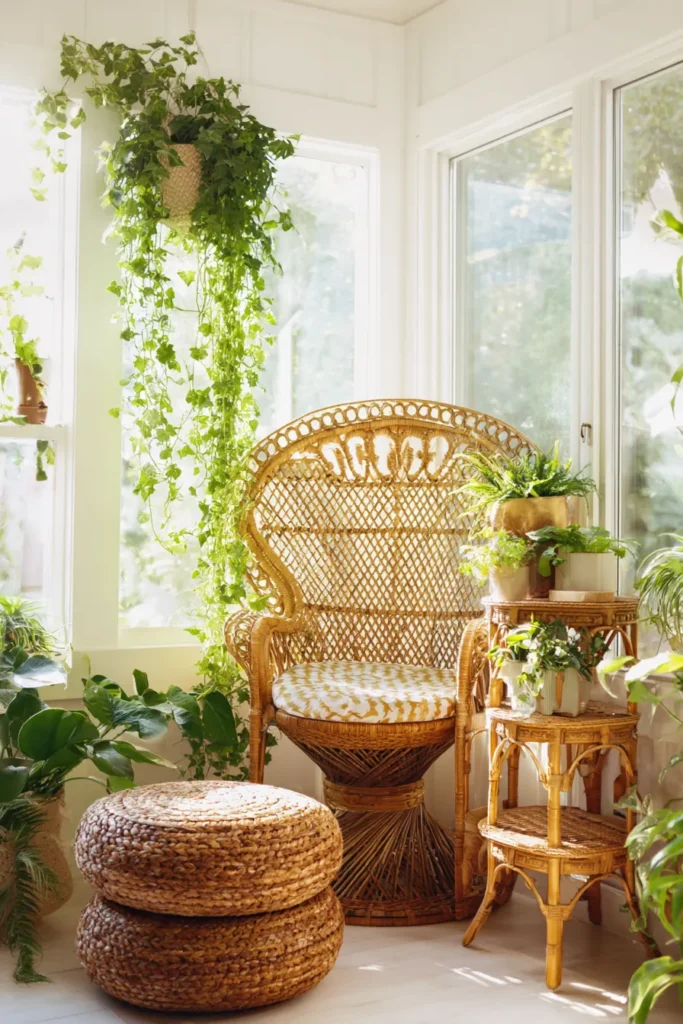
7. The Sun-Drenched Greenhouse Nook
Reading surrounded by plants is a completely different experience.
There is actual science behind this. Greenery naturally boosts serotonin levels, which means you genuinely feel better sitting in a plant-filled space than in a bare room. The combination of natural light and living plants creates an atmosphere that is simultaneously energizing and calming.
The centerpiece here is a durable rattan peacock chair. It is one of those pieces that looks incredible in photos but is also genuinely comfortable to sit in for long stretches. A light woven pouf next to it serves as a footrest and occasional extra seating.
How to layer the plants for maximum effect:
- Use tiered plant stands to create depth at different heights
- Group plants by height to build a lush canopy effect
- Hang trailing vines from the ceiling to draw the eye upward
Stick to a fresh palette of vibrant botanical greens, bamboo tones, and crisp white. Keep the fabrics light and slightly outdoor-friendly since humidity from the plants is a real consideration.
Designer tip: Hang trailing vines from the ceiling. It transforms a corner into something that feels genuinely immersive rather than just decorated.
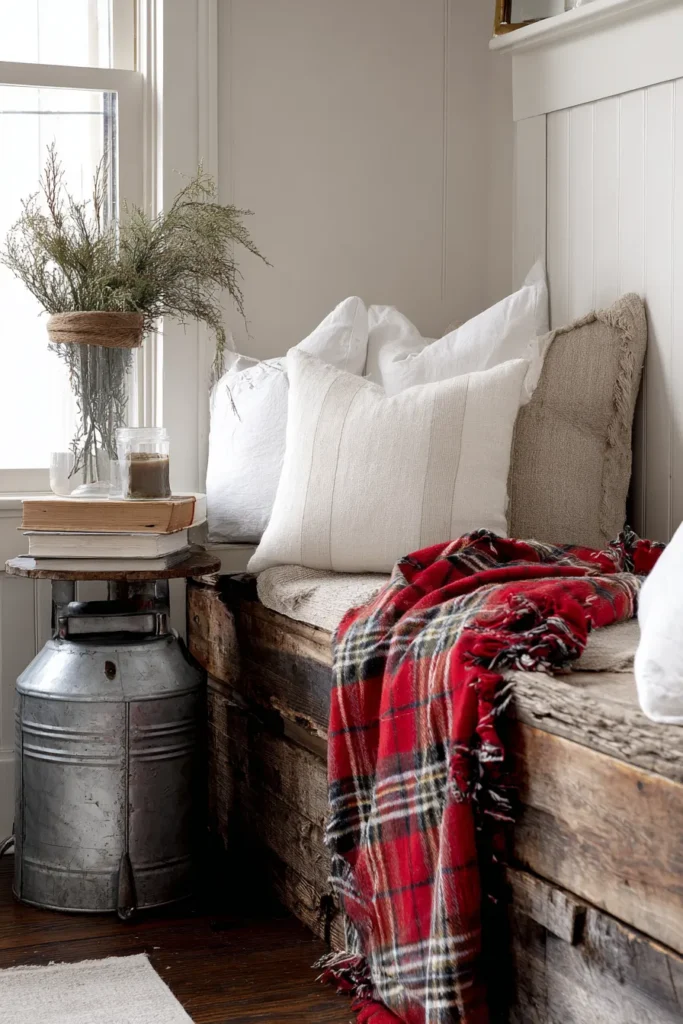
8. The Rustic Farmhouse Bench
There is something deeply nostalgic about weathered wood and simple, honest materials.
This reading nook style taps into that feeling immediately. The rough textures, the faded finishes, the sense that everything in the room has a story behind it. It is the kind of space that feels warm the moment you walk in, before you have even sat down.
The key pieces are a reclaimed wood bench and a galvanized metal side table. A classic plaid throw blanket draped casually over the bench adds color and visual interest without any fuss.
For colors, warm whites, charcoal blacks, and faded barn reds work together beautifully. It is a palette that feels lived-in and genuine.
Materials that define this style:
- Heavy canvas for cushion covers
- Distressed pine for shelving and accent pieces
- Raw iron hardware for hooks and fixtures
- A vintage milk jug repurposed as a holder for bookmarks or reading glasses
Designer tip: Mix distressed wood finishes with crisp white cushions. The contrast prevents the space from feeling too heavy or dark and keeps things feeling fresh.
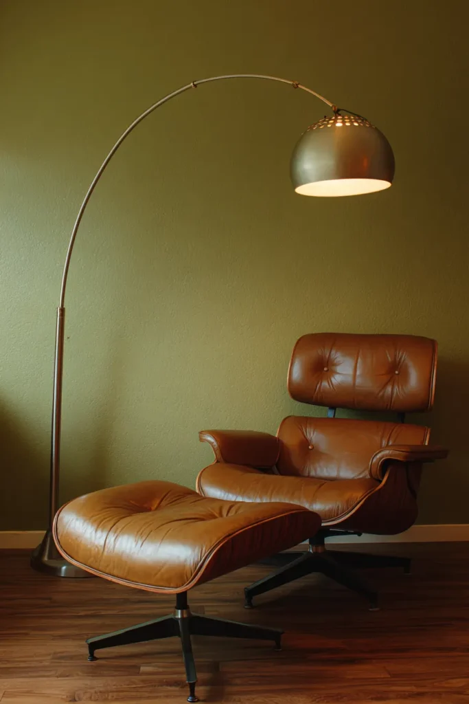
9. The Mid-Century Modern Leather Lounge
Some furniture designs are just right.
The mid-century modern lounge chair is one of them. It has been around since the 1950s and it is still one of the most comfortable and visually satisfying ways to sit and read. The clean lines, the organic curves, the perfect balance between form and function. It works because it was designed with the human body in mind.
The absolute centerpiece here is a classic Eames-style lounge chair with its matching ottoman. A sweeping arc floor lamp stretching over the top adds striking geometry and provides excellent task lighting.
The palette stays rich and warm. Teak wood, burnt orange, deep olive green. These are colors that age incredibly well and look better the longer they live in a room.
Why this style works so well:
| Feature | Benefit |
|---|---|
| Ergonomic chair design | Comfortable for long reading sessions |
| Arc floor lamp | Directional light without a side table lamp |
| Minimal accessories | Furniture shapes take center stage |
| Warm wood tones | Ages beautifully over time |
Designer tip: Place the chair at a slight angle rather than flush against the wall. It makes the whole setup feel more intentional and creates better sightlines from across the room.
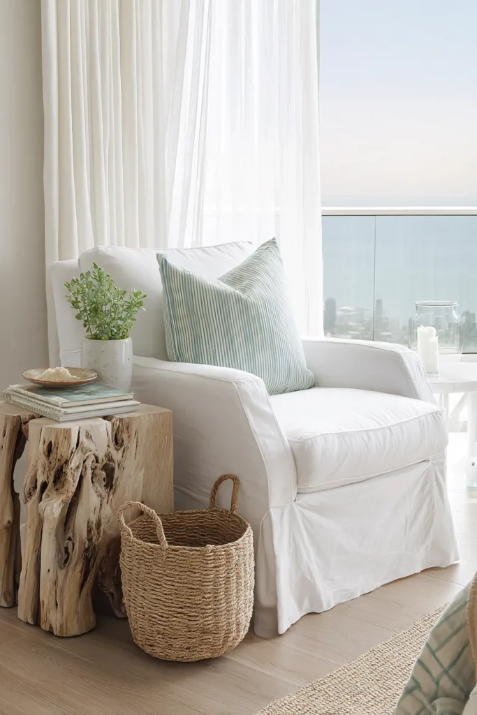
10. The Coastal Breezy Window Corner
Close your eyes and imagine reading on a porch near the ocean.
Now bring that feeling indoors.
That is exactly what this style achieves. Light, airy, unhurried. The kind of space where your shoulders drop the moment you sit down and your mind stops racing. The bright tones and relaxed textures actively promote a calm mental state, which makes this one of the most genuinely restful reading setups on this list.
The key pieces are a white slipcovered armchair and a natural driftwood side table. Light, sheer curtains that billow slightly in a breeze add a sense of movement that makes the corner feel alive.
For colors, seafoam green, sandy beige, and crisp ocean blue. A striped lumbar pillow subtly reinforces the coastal theme without making it feel themed or overdone.
Materials to lean into:
- Washed linen for that relaxed, soft texture
- Natural jute for rugs and baskets
- Sea glass accents as small decorative touches
- A woven seagrass basket on the floor for your current reading stack
Designer tip: The striped lumbar pillow is doing more work than it looks like. It ties the color palette together and nods to the nautical theme without screaming beach house.
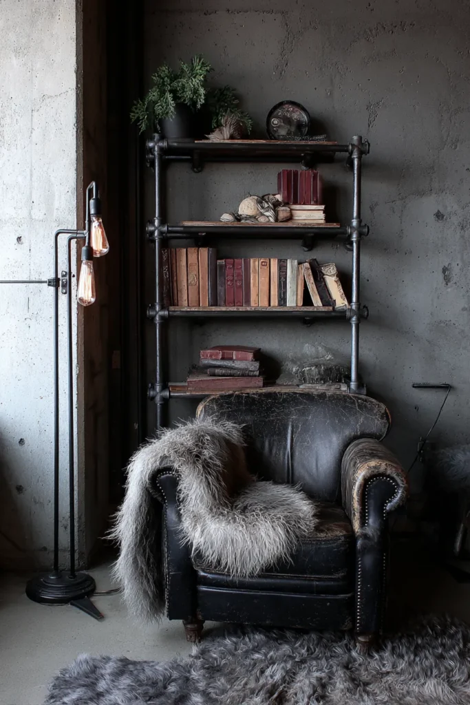
11. The Industrial Loft Mesh and Leather
This reading nook does not apologize for being bold.
Raw materials, exposed hardware, contrasting textures. The industrial loft aesthetic creates a dramatic, edgy reading space that feels completely different from anything soft or traditional. And that contrast is actually what makes it so stimulating. The mix of tough and refined textures keeps your environment visually interesting.
The essential pieces are a distressed leather club chair and a black iron pipe bookshelf. An exposed Edison bulb floor lamp provides warm amber light that softens the hard industrial edges just enough.
The palette leans dark and moody. Brick red, concrete gray, matte black iron.
Texture combinations that make this work:
- Cold rolled steel frames paired with heavily distressed vintage leather
- Horizontal and vertical book arrangements that create an architectural shelving display
- A plush faux sheepskin draped over the chair to soften the metal-heavy environment
Designer tip: That faux sheepskin is essential. Without it, the space risks feeling too cold and hard. One soft, textural element bridges the gap between industrial edge and reading comfort.
12. The Pastel Serenity Space
Some reading nooks are designed to energize. This one is designed to calm.
Pastel colors have a genuinely measurable effect on stress levels. Soft, muted hues reflect light gently without overwhelming the senses. Walking into a pastel reading corner is like exhaling after a long, tense day.
The key design elements here are a curved bouclé accent chair and an arched floor mirror. The curved lines of both pieces reinforce the gentle, unhurried energy of the space. A small terrazzo side table adds just enough playful texture to keep things from feeling too precious.
The palette is dreamy and deliberate. Mint green, blush pink, soft lavender. All muted, all light-reflective, all deeply restful.
Materials that define this style:
| Material | Why It Works |
|---|---|
| Nubby bouclé | Tactile comfort, visually soft |
| Smooth velvet | Rich depth without heaviness |
| Frosted glass | Reflects light gently |
| Terrazzo | Adds subtle texture and playfulness |
Keep your book display to your current favorites only. A curated stack of three or four books looks intentional. A full overflow situation breaks the calm visual rhythm this style depends on.
Designer tip: Position the arched floor mirror on the adjacent wall. It bounces light around the space and makes even a small corner feel noticeably larger and airier.
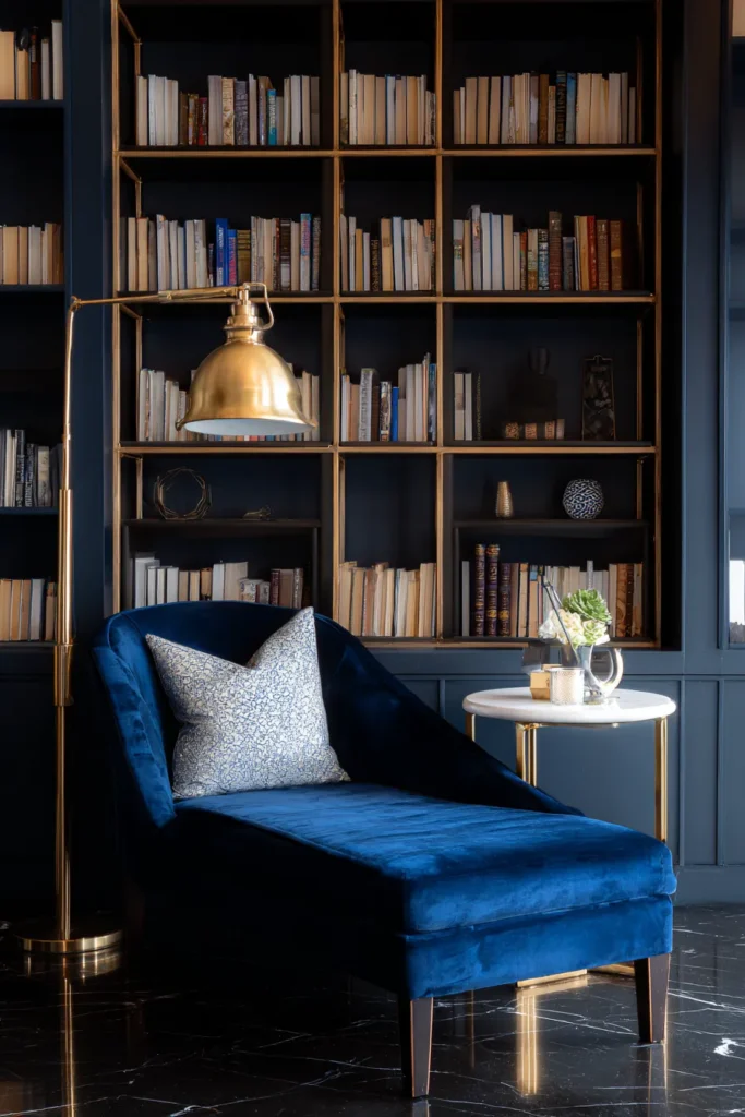
13. The Modern Glam Velvet Settee
Reading does not always have to feel quiet and understated.
Sometimes you want your reading corner to feel like an event.
The modern glam style turns a simple hobby into something that feels genuinely luxurious. A jewel-toned velvet settee or oversized armchair in sapphire blue is the anchor piece here. Everything else builds around it.
A gold geometric shelving unit provides an elegant home for your books while doubling as a serious design statement. A small mirrored side table reflects your ambient lighting beautifully and adds depth to the corner.
The palette is confident and opulent. Sapphire blue, brushed brass, crisp white. The contrast between deep jewel tones and bright metallic accents is what gives this style its energy.
High-impact material choices:
- Crushed velvet for maximum drama and tactile luxury
- Polished marble for the side table surface
- Shiny gold metals throughout for warmth and cohesion
Designer tip: When mixing metals in this style, commit to brass and gold only. Mixing in silver or chrome immediately fragments the warmth and undermines the cohesive glamour you are going for.
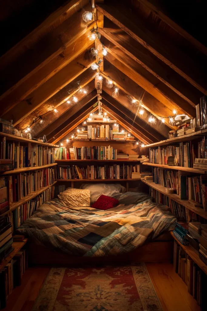
14. The Attic Hideaway
If you have attic space in your home, you have a secret weapon.
The sloped ceilings that make attics tricky for other purposes make them perfect for reading nooks. That low, angled ceiling physically wraps around you in a way that feels sheltered and intentional. Like the house itself is giving you a hug.
The setup here is simple and intentional. A low-profile custom mattress or thick futon placed directly on the floor. Low, horizontal bookshelves that follow the roofline angle rather than fighting against it. Fairy lights strung along the ceiling beams for a soft, magical glow after dark.
The palette stays warm and cocooning. Warm whites, soft grays, natural pine.
Layered comfort essentials:
- Flannel sheets for the futon base layer
- Down pillows for genuine softness
- A thick wool rug to insulate the floor from attic drafts (this one is not optional)
That rug matters more than people think in an attic space. Cold air settles at floor level and a bare attic floor can make the whole setup feel uncomfortable regardless of how beautiful everything else looks.
Designer tip: Always insulate the floor properly with a thick rug before doing anything else in an attic nook. Comfort from the ground up is the foundation of the whole setup.
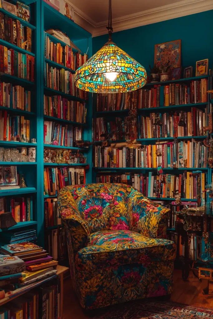
15. The Maximalist Library Vibe
Some people want calm and minimal. Others want drama.
If you fall into the second camp, this is your style. The maximalist reading library is bold, loud, and completely unapologetic about it. We are talking floor-to-ceiling bookshelves packed so full that books start living on the floor too. And honestly? That is part of the charm.
The magic here is contrast. Think deep jewel tones, rich lacquer finishes, and dark mahogany wood that feels like stepping into a private study from another century. Layer in a brightly patterned floral armchair and a Tiffany-style stained-glass lamp, and you have got a corner that practically breathes personality.
The walls? Go teal. A deep, vibrant teal that makes every spine on your shelf pop like art in a gallery.
Quick styling tips:
- Stack books on the floor when shelves overflow (it is not messy, it is maximalist)
- Mix hardcovers and paperbacks freely for visual texture
- Paint your bookcases a bold contrasting color so your collection becomes the focal point
Designer tip: Do not hold back on the books. Overflow is the whole point here. The more lived-in and layered it looks, the better.
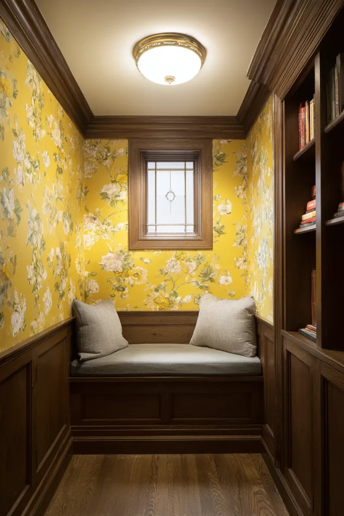
16. The Closet Conversion (Cloffice/Nook)
Here is a little secret most people overlook.
That unused closet in your bedroom or hallway? It is basically a reading nook waiting to happen.
Remove the doors. That is literally the first step. Once those doors come off, you are suddenly looking at a cozy, enclosed alcove with walls on three sides. Add custom-cut bench seating and some cheerful peel-and-stick wallpaper on the interior walls, and the whole thing transforms completely.
It is brilliant for smaller homes because you are not taking up space. You are using space that was already there, just ignored.
For lighting inside the alcove, a flush-mount ceiling light or battery-operated sconces work perfectly. Just enough warm light to read comfortably without straining.
Color palette to consider:
| Element | Recommended Option |
|---|---|
| Walls (interior) | Sunny yellow floral wallpaper |
| Bench cushion | Light gray |
| Trim | Crisp white wood |
| Ceiling light | Warm white flush-mount |
Smooth MDF for the bench keeps things affordable and easy to paint. Durable vinyl peel-and-stick wallpaper means you can swap the look later without any commitment or damage.
Designer tip: Frame the closet opening with decorative wooden trim. It instantly makes the whole thing look like it was always meant to be there, not like a weekend DIY project.
And do not forget a drawer installed underneath the bench. It is the perfect hidden spot for seasonal items, extra blankets, or anything else you want completely out of sight.
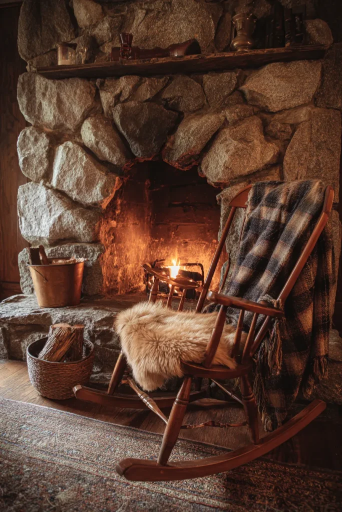
17. The Fireplace Hearth Spot
There is something almost primal about reading next to a fire.
The warmth on your skin, the soft crackling in the background, the way the flames move just at the edge of your vision while your eyes follow words across a page. It is one of those simple pleasures that genuinely never gets old.
This setup keeps things traditional and grounded. A low wooden rocking chair positioned right beside the hearth, close enough to feel the warmth but angled slightly away from direct heat. That small detail matters more than you might think. Direct heat exposure over time can dry out and warp furniture finishes significantly.
A thick sheepskin rug on the hearth keeps cold stone away from your feet. A wool tartan blanket draped over the chair arm is ready whenever the temperature drops. And a beautiful brass bucket nearby holds extra blankets in a way that looks completely intentional.
The essential components:
- Low, comfortable rocking chair
- Plush sheepskin rug on the hearth
- Heavy iron fireplace toolset
- Wool tartan throw blanket
- Brass bucket for firewood or extra reading blankets
The color palette here leans fully traditional. Brick red, warm cream, and forest green. These colors have worked together for centuries, and there is a very good reason for that.
Designer tip: Angle your chair slightly away from the direct line of heat. Your furniture will last significantly longer, and you will actually be more comfortable at reading distance from the fire.
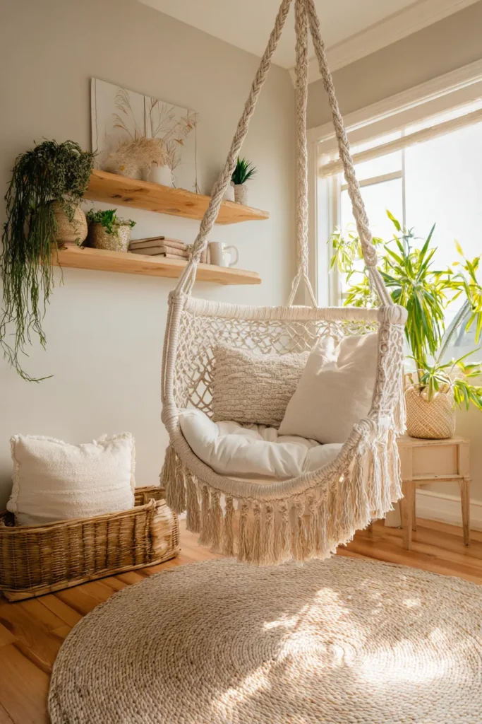
18. The Corner Hammock Chair
Forget everything you know about reading chairs for a moment.
What if your chair swung?
A hanging hammock chair mounted from the ceiling brings something genuinely different to a reading corner. The gentle, slow rocking motion is almost meditative. It calms the nervous system in a way that a stationary chair simply cannot replicate. Once you try reading in one, sitting in a regular chair afterward feels oddly rigid.
The look is breezy and natural. A sturdy canvas or macrame hanging chair, soft linen pillows in white and muted clay tones, a round jute rug underneath to anchor the whole floating setup. Mount a small floating shelf on the adjacent wall so your coffee mug has a safe, stable surface to sit on.
Color and material breakdown:
| Element | Material and Color |
|---|---|
| Chair | Woven cotton macrame or canvas |
| Pillows | Soft linen, white and clay tones |
| Rug | Round jute, natural beige |
| Wall shelf | Light-toned floating wood |
One thing to take seriously: follow the weight capacity and ceiling stud requirements when installing the mounting hardware. This is not a step to rush or estimate. Done correctly, it is completely safe and one of the most enjoyable reading setups on this entire list.
Designer tip: Locate a ceiling stud before purchasing any mounting hardware. The stud placement will determine exactly where your chair hangs, so plan around structure first and aesthetics second.
19. The Vintage Victorian Corner
Walking into a Victorian reading corner feels like stepping through a door in time.
Everything here has history. A tufted velvet parlor chair in dusty plum. A fringed lampshade glowing softly over a beautifully carved mahogany side table. Antique hardcover books arranged not just for reading but for display. Delicate lace trims, heavy brocade fabric, and carved woodwork everywhere you look.
This style works because vintage pieces carry a kind of character that new furniture simply cannot reproduce. The slight imperfections, the intricate craftsmanship details, the genuine weight of aged materials. It all adds up to something that feels completely alive in a way modern pieces rarely do.
Key elements to pull the look together:
- Tufted velvet parlor chair in dusty plum
- Fringed lampshade on a carved wooden side table
- Antique hardcover books used as both decor and reading material
- Heavy brocade textiles and delicate lace accents throughout
- Carved mahogany as the primary wood
For the palette, lean into dusty plum, antique gold, and deep forest green. These colors feel like they were made for this aesthetic.
The best part? You should not buy everything new here. In fact, you really should not. Scour local estate sales and antique markets. That is where you find the genuinely unique, period-accurate lighting fixtures that make the whole room feel completely authentic rather than costume-like.
Designer tip: One genuinely antique lamp from an estate sale will do more for this corner than five brand-new items that only look vintage.

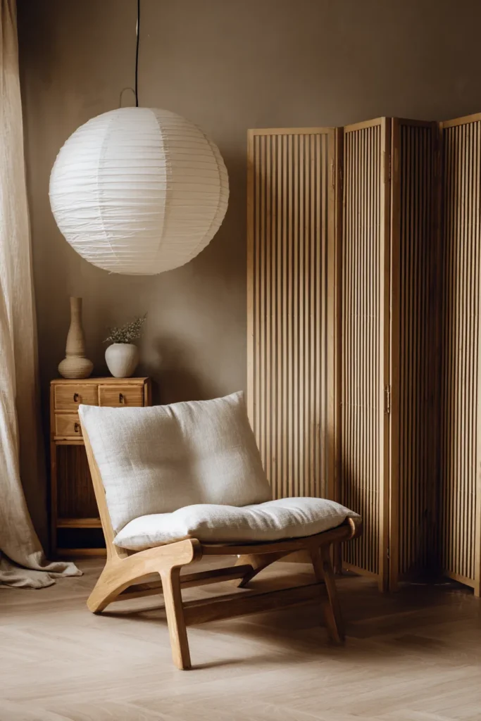
20. The Zen Japandi Retreat
Sometimes the most powerful thing you can do in a room is simply remove things.
The Japandi reading retreat is built on exactly that philosophy. It blends Japanese minimalism with Scandinavian functionality, and the result is a space that feels genuinely calm from the moment you step into it. No clutter. No visual competition. Just clean lines, natural materials, and quiet intention.
The chair sits low to the ground. A paper lantern floor lamp casts soft, diffused light. A bamboo room divider separates the nook from the rest of the room, creating a pocket of privacy without building actual walls.
Every single material choice here is deliberate:
- Raw linen for cushions and throws
- Rice paper for the lantern shade
- Unfinished light wood for all furniture pieces
- Bamboo for the room divider
The palette stays completely muted. Warm beige, soft charcoal, natural bamboo tones. Nothing competes for your attention. That is entirely the point.
Color palette overview:
| Element | Color and Material |
|---|---|
| Chair cushion | Raw linen, warm beige |
| Lamp | Rice paper lantern, soft glow |
| Room divider | Natural bamboo |
| Floor | Light wood or stone with woven rug |
| Walls | Soft charcoal or warm off-white |
Designer tip: Place a shoji screen near any window that receives harsh afternoon sun. It diffuses the light softly rather than blocking it entirely. The space stays open and bright while your eyes stay comfortable for long reading sessions.
This is a nook designed for deep reading. The kind where an hour passes and you genuinely did not notice.
Frequently Asked Questions
How much does it typically cost to create a cozy reading nook?
The range is wider than most people expect.
A budget-friendly setup using thrifted chairs, existing throw pillows, and a single floor lamp can come together for well under $100. On the other end of the spectrum, custom built-in window seats or high-end mid-century loungers can run anywhere from $500 to well over $2,000.
The good news? You do not have to do it all at once. Start with one comfortable chair. Then slowly layer in lighting, a rug, and cushions over time. A reading nook built gradually often feels more personal than one assembled in a single shopping trip.
What is the best type of lighting for a reading space?
Layered lighting is always the answer.
You need two things working together: ambient light for the general room and targeted task lighting aimed directly at your reading material. An adjustable floor lamp positioned just over your shoulder is the classic solution, and it works because it has been perfected over decades.
For bulb temperature, always choose warm white in the 2700K to 3000K range. Cooler, bluer bulbs create genuine eye strain during long reading sessions. Warm bulbs reduce that strain and create the soft, comforting glow that makes you want to stay in that corner for just one more chapter.
How do I make a small corner feel like a distinct reading area?
Three simple moves make a significant difference:
- Use a specific area rug to define the footprint of your space visually
- Add a distinct wall color or a panel of peel-and-stick wallpaper directly behind the chair to create a clear visual boundary
- Angle your chair inward slightly so it faces away from the rest of the room, creating a natural sense of separation and enclosure
You do not need walls. You just need visual cues that tell your brain: this spot is different. This spot is for reading.